how to increase ecommerce conversion rate: 5 proven tactics
how to increase ecommerce conversion rate: quick wins to boost sales and optimize checkout, product pages, and mobile UX.
Dec 5, 2025
generated
increase ecommerce conversion rate, ecommerce CRO, checkout optimization, product page conversion, mobile commerce UX
If you want to increase your ecommerce conversion rate, you need to stop guessing and start strategizing. It’s not about throwing random tactics at the wall and hoping something sticks. It's about building a repeatable, data-driven system.
The first step is always the same: figure out exactly where you stand right now. From there, you can identify the most important metrics to track and build a prioritized roadmap of fixes that actually move the needle.
Your Blueprint for Higher Conversion Rates
Boosting your conversion rate is a process, not a magic trick. It's about systematically turning casual browsers into happy, loyal customers. We're going to walk through a structured framework that begins with understanding your current performance before you change a single thing.
This approach is the heart of Conversion Rate Optimization (CRO). The entire game is about making small, informed changes that lead to significant, measurable growth. Once you start thinking like a CRO specialist, you’ll see opportunities everywhere.
The Core CRO Framework
The journey to a higher conversion rate is a continuous cycle. You measure, identify friction points, and then strategically implement and test solutions. It’s a loop that ensures your efforts are always focused and effective, not just busywork.
This simple workflow is the foundation of any successful CRO initiative.
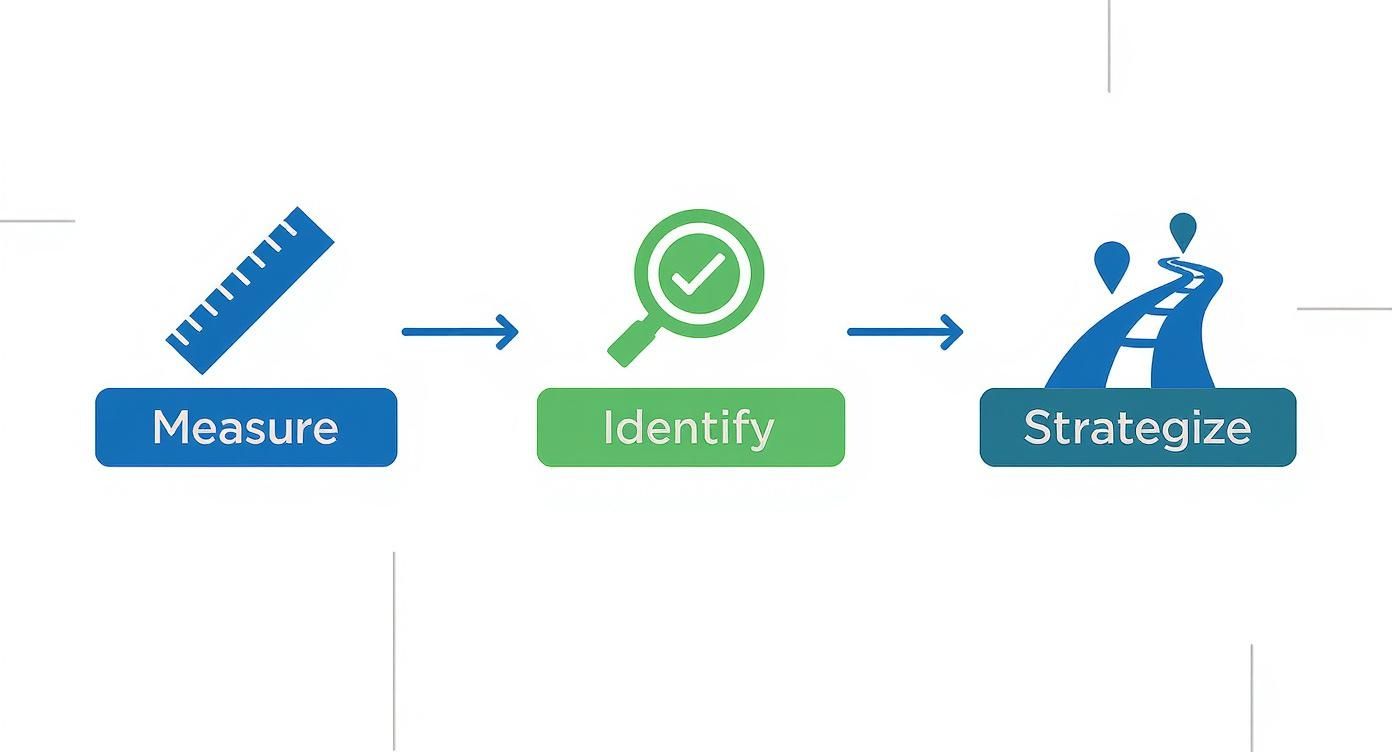
Following this measure-identify-strategize process keeps you from wasting time and money on changes that don’t make a real difference to your bottom line.
Why a Strategic Approach Matters
Without a solid baseline, you're flying blind. How can you know if your changes are working if you haven't defined what "working" even means for your brand? The industry average ecommerce conversion rate hovers somewhere between 2.5% and 3%, but that number is almost meaningless without context. It varies wildly based on your industry, traffic source, and price point. Your first job is to find your number.
By establishing a clear baseline and focusing on incremental improvements, you create a powerful feedback loop. Each change provides new data, which in turn informs your next strategic move, creating sustainable growth over time.
This foundation allows you to think beyond just one metric and build a more holistic growth strategy. For a deeper dive into driving revenue, our guide on how to increase ecommerce sales offers some great complementary ideas.
Building your blueprint starts with a few key actions:
Define Your KPIs: Look past the overall conversion rate. You need to track metrics like Add to Cart rate, checkout completion rate, and Revenue Per Visitor (RPV) to get a truly detailed picture of your funnel's health.
Set Up Your Tools: Get comfortable with an analytics platform like Google Analytics 4 to track user behavior. For visual insights, tools like heatmaps and session recordings can show you exactly where users are getting stuck or dropping off.
Create a Prioritization Matrix: Not all fixes are created equal. Use a simple framework to rank potential changes based on their likely impact versus the effort required to implement them. This is how you find the low-hanging fruit.
Quick Wins to Boost Your Conversion Rate
Before diving into a massive overhaul, there are often high-impact, low-effort changes you can make right away. This table highlights a few quick wins to get the momentum going.
Strategy | Potential Impact | Implementation Effort |
|---|---|---|
Add a "New Arrivals" section | Medium | Low |
Add trust badges to checkout | High | Low |
Improve on-model product photos | High | Medium |
Optimize mobile button size/placement | High | Low |
Add a sticky "Add to Cart" bar | Medium | Low |
Starting with these quick wins can give you an immediate lift, proving the value of CRO to your team and building excitement for bigger projects down the road. This disciplined approach ensures you tackle the most critical issues first, delivering results that compound over time.
Turning Your Product Pages into Sales Engines
Let's be honest: your product page is where the magic happens—or doesn't. It's the final moment of truth before a customer clicks "add to cart." Every single element has to work in harmony to build confidence and spark that "I need this" feeling. Think of it less like a catalog entry and more like your star salesperson, ready to close the deal 24/7.
A clunky, uninspired page creates friction. It plants seeds of doubt and sends potential buyers running. But a great one? It anticipates their questions, showcases the product's true value, and makes the decision to buy feel both easy and exciting. Nailing this is fundamental to boosting your conversion rate.
Writing Product Copy That Actually Sells
The point of a product description isn't just to describe the product; it's to sell the experience. Your copy has to connect the dots between a feature and a feeling, helping the shopper truly visualize how this item will fit into their life. Generic, spec-heavy descriptions fall flat because they don't speak to the customer's desires.
Don't just say "100% organic cotton." Instead, paint a picture: "Imagine the feel of this breathable, all-day comfort, so gentle on your skin." That's the difference between a feature and a benefit.
To get your copy working harder for you:
Answer Questions Before They're Asked: What would a customer ask an associate in a physical store? Get ahead of it. Cover sizing, fit, material care, and how to style it right there in the description.
Use Sensory Language: Help them feel the product through words. "Silky," "lightweight," "structured," and "cozy" create a far more vivid mental image than just listing the fabric composition.
Make it Scannable: Let's face it, people skim. Use short paragraphs, punchy bullet points, and bold text to make sure the key selling points jump off the page.
The Unspoken Power of High-Quality Visuals
In ecommerce, your photos and videos have to do all the work that a customer's hands would in a brick-and-mortar shop. They are relying entirely on what they see to judge quality, fit, and texture. Time and again, research confirms that professional, high-quality imagery is one of the biggest drivers of a purchase decision.
Grainy, poorly lit photos shot from one angle scream "amateur" and erode trust instantly. On the flip side, crisp, detailed visuals build immediate confidence and crush hesitation. You need to show your product from every angle imaginable, letting shoppers zoom in on the details—the stitching, the fabric's weave, the quality of the hardware.
A landmark study found that a staggering 75% of online shoppers rely on product photos to make a purchase decision. Visuals aren't a nice-to-have; they are the very heart of the online shopping experience.
For fashion and apparel brands, on-model photography is essential. It's not optional. It shows customers how a garment hangs, how it fits, how it moves on a real body. This answers those critical, unspoken questions about length, drape, and silhouette. To take it a step further, product videos showing the item in motion can be a massive game-changer for engagement and conversions. If you're looking to level up your imagery, our guide on how to take professional product photos is a fantastic place to start.
Building Rock-Solid Trust with Social Proof and Transparency
Once a customer likes what they see, a new question pops into their head: "Can I trust this brand?" This is where social proof and clear trust signals step in to turn a hesitant browser into a confident buyer.
Authentic customer reviews are your most powerful weapon here. They offer unbiased validation from real people, and that's infinitely more persuasive than anything you could write yourself. Don't just show the five-star raves; feature a mix of reviews, especially those that get specific about fit, quality, and their overall experience.
Beyond reviews, you need to have other trust signals displayed loud and clear:
Crystal Clear Shipping Info: Be upfront about costs and delivery estimates before they even think about the checkout. Surprise shipping fees are the #1 killer of conversions.
A Hassle-Free Return Policy: A straightforward, generous return policy removes all the risk for the customer. Knowing they can easily send something back if it’s not right makes them far more likely to take the plunge.
Security Badges: Displaying the logos of trusted payment gateways (like Visa, PayPal, Apple Pay) and security seals reassures shoppers that their personal and financial information is locked down tight.
When you combine persuasive copy, stunning visuals, and undeniable trust signals, your product page stops being a static catalog entry. It becomes a dynamic, automated sales engine that actively works around the clock to drive your conversion rate higher.
Building a Foundation of Trust and Urgency
Every online sale hinges on one invisible currency: trust. A customer won't even think about pulling out their credit card unless they feel completely safe and confident in your brand. Without that fundamental trust, even the most stunning product pages will fall flat.
At the same time, you need to gently nudge shoppers from a "maybe later" mindset to a "buy now" decision. This is where you can ethically introduce a bit of urgency and scarcity. When you combine a secure, trustworthy shopping environment with compelling reasons to act, you create a powerful formula for boosting your conversion rate.
It's all about finding that perfect balance—addressing hesitation while encouraging decisive action, guiding customers smoothly toward that final click.
Weave Trust Signals into Every Step
Trust isn’t something you build with a single badge at checkout. It's a cumulative effect, built by sprinkling signals of reliability throughout the entire customer journey. You need to reinforce their decision at every turn.
Start with the absolute basics. Your site must have an SSL certificate—that little padlock icon in the browser bar. This is non-negotiable. From there, think about visual cues. Strategically display logos of trusted payment providers like PayPal, Visa, and Apple Pay. These familiar symbols are a mental shortcut for shoppers, instantly telling them their information is in good hands.
One of your most powerful, yet often overlooked, trust signals is your return policy. A clear, hassle-free return policy completely removes the financial risk for the customer. If they know they can send something back without a headache, they're far more likely to make that initial purchase.
Don't bury your policy in the footer. Make it easy to find and even easier to understand. Frame it as a benefit, not a chore. A "30-Day Happiness Guarantee" just sounds so much better than a generic "Standard Return Policy," doesn't it?
The Art of Ethical Urgency
Urgency isn't about tricking people. It’s about motivating them to act on a decision they’re already leaning toward. The key is to be genuine. Fake countdown timers and inflated stock alerts will only torpedo your brand's credibility in the long run.
Here are a few effective ways to create authentic urgency:
Low Stock Alerts: Displaying "Only 3 left in stock!" creates a natural sense of scarcity. This works like a charm for popular items, prompting shoppers who are afraid of missing out to act now.
Time-Sensitive Offers: Limited-time discounts and flash sales are classics for a reason. Use clear countdown timers on product pages and in a site-wide banner to give the deadline a real, visual presence.
Shipping Cutoffs: This is a huge motivator around holidays or specific events. A banner that reads, "Order by midnight for Valentine's Day delivery," ties the purchase to a tangible, time-sensitive outcome they care about.
Using Social Proof as Your Ultimate Endorsement
Nothing builds trust faster than seeing that other people have already bought and loved your product. That’s the magic of social proof. It provides unbiased validation that's far more persuasive than anything you could ever write in your marketing copy.
Place customer testimonials and reviews right on your product pages where they can't be missed. And don't just show the five-star ratings; feature reviews that are detailed and specific. A review that says, "The fit of this dress is amazing, perfect for a summer wedding," is infinitely more helpful than one that just says "Great product."
User-generated content (UGC), like customer photos, takes this a step further by showing your product in a real-world context. This helps new shoppers visualize themselves using it. For fashion brands, seeing how an item looks on different body types is incredibly powerful. Videos can provide an even more dynamic form of social proof, too. If you're looking for ideas, check out our guide on how to create product videos that grab attention and earn trust.
Plugging the Leaks in Your Checkout Funnel
Getting a customer to click "add to cart" is a huge milestone, but let's be honest, it's not the finish line. The checkout is where an almost unbelievable number of sales simply vanish into thin air. It’s the final, most delicate stage of the journey, and any friction—no matter how small it seems to you—can send a motivated buyer packing.
Think of your checkout as a funnel. Right now, it’s probably leaking. Your job is to find those leaks and patch them, making sure every qualified customer who starts the checkout process actually finishes it.
Stop Forcing Account Creation
This is the big one. If I had to pick the single fastest way to kill a sale, it would be forcing a new customer to create an account before they can buy something. It's a massive, unnecessary roadblock.
At this point, your customer has one goal: give you money. Asking them to stop, dream up a password, and fill out extra fields is frustrating and completely breaks their momentum.
Always, always offer a prominent guest checkout option. Make it the clearest, easiest path forward. You can always invite them to create an account on the "thank you" page after the sale is locked in.
Simplify, Simplify, Simplify
Complexity is the sworn enemy of conversion. Your checkout flow should be ruthlessly simple, asking only for the information that is absolutely essential to get the product to their door. Every extra form field is another chance for them to hesitate and abandon their cart.
Here’s a quick checklist I use to audit checkouts:
Minimize Form Fields: Do you really need their phone number? Can you use an address auto-complete tool to save them some typing? Cut every single thing that isn't required for shipping and payment.
Show a Progress Bar: Let people know where they are in the process (e.g., Shipping > Payment > Review). It manages expectations and makes the whole thing feel shorter and less intimidating.
Aim for a Single Page: If you can, a single-page checkout is the gold standard. It reduces clicks and keeps everything in one place. If you absolutely have to use multiple pages, make sure the flow is lightning-fast and dead simple.
No More Surprise Costs. Period.
The number one reason for cart abandonment, hands down, is unexpected costs. A customer has mentally agreed to a price by the time they hit the checkout button. When they're suddenly slapped with high shipping fees or mysterious taxes, it feels like a bait-and-switch. Trust evaporates instantly.
Be radically transparent with every single cost. Show shipping fees and estimated taxes directly on the product page or in the cart itself—long before they get to the final payment screen. This kind of honesty prevents the sticker shock that sends over 48% of shoppers running for the hills.
Nothing loses a sale you already had in the bag faster than a surprise on the final bill.
Offer Payment Options People Actually Use
In today's world, customers expect flexibility. Forcing them to manually punch in 16 digits when they're used to one-click payments feels ancient. Your checkout needs to be as seamless as the rest of their digital life.
Integrating modern payment gateways isn't just a "nice-to-have" anymore; it's a non-negotiable part of winning the sale.
Digital Wallets: Offer express checkout options like Apple Pay, Google Pay, and PayPal. These let customers pay in seconds without having to go find their wallet.
Buy Now, Pay Later (BNPL): Services from companies like Klarna or Afterpay can be a game-changer, especially for higher-priced items. They break down the cost into manageable chunks, making a "yes" decision much easier for the customer.
The data on this couldn't be clearer. The average cart abandonment rate across the globe is a staggering 70.19%. However, research shows that a simplified, trustworthy checkout—one with guest options and modern payment methods—can dramatically reduce that number. You can dig into more ecommerce statistics and their impact on conversions to see for yourself.
By plugging these common leaks, you stop losing the sales you worked so hard to get in the first place. A smooth, transparent, and flexible checkout doesn't just bump your conversion rate; it builds the kind of trust that turns one-time buyers into loyal customers.
Nail Your Mobile Experience and Site Speed
Let's be blunt: your mobile site isn't just a "nice to have" or a shrunken version of your desktop experience. For the vast majority of your customers, it is your primary storefront. A slow, clunky, or confusing mobile journey is the modern-day equivalent of a locked door on a physical shop – you're turning away paying customers before they even get a chance to browse.
Winning over today's shopper means seeing your store through their eyes and, more importantly, through their phone screen. It’s all about creating a fast, intuitive, and thumb-friendly experience that makes buying from you feel completely effortless.
Design for Thumbs, Not Cursors
Think about the physical difference between navigating with a precise mouse cursor and a much broader thumb. This one simple distinction should inform every single design choice you make for your mobile site.
Most people hold their phones in a way that creates a natural "thumb zone"—an area on the screen they can comfortably reach. Placing crucial elements like your menu, search bar, and especially the "Add to Cart" button within this zone is a game-changer. It instantly makes your site feel easier to use.
Here are a few core principles for a thumb-friendly design:
Make Buttons Big and Tappable: There’s nothing more frustrating than trying to hit a tiny link and tapping the wrong one. Make sure your buttons and calls-to-action are generously sized to avoid mis-taps.
Simplify Your Navigation: Forget those sprawling, multi-level dropdown menus that work fine on desktop. On mobile, you need a clean, streamlined menu (like the classic "hamburger" icon) that gets people to top-level categories without a fuss.
Keep Forms Short and Sweet: Nobody enjoys typing out their life story on a tiny keyboard. Cut your forms down to the absolute essentials, use large fonts in the input fields, and enable autofill wherever possible.
Every Millisecond Counts
Site speed isn't some abstract technical metric for your developers to worry about; it's a core part of your customer experience. A slow-loading page is the fastest way to lose a sale.
A delay of even one second can cause a huge drop in conversions, and this is magnified on mobile, where connections can be spotty and patience is thin.
The data doesn't lie: 53% of mobile visitors will bounce if a page takes more than three seconds to load. Speed is no longer a feature; it's a fundamental requirement for keeping a potential customer on your site.
To get your site moving faster, start with these high-impact fixes:
Compress Your Visuals: Big, beautiful images sell products, but unoptimized files are the number one killer of page speed. Use image compression tools to shrink file sizes without a noticeable drop in quality.
Trim Your Code: Every plugin, third-party script, and extra line of code adds weight to your site. Do a regular audit and get rid of anything that isn’t absolutely critical to the shopping experience.
Use Browser Caching: Caching is a clever way to store parts of your site (like your logo and navigation) on a visitor's device. When they come back, their browser doesn't have to re-download everything, making the page load almost instantly.
Focusing on mobile has paid off across the industry, with mobile conversion rates climbing from 1.8% to 2.9%. While desktop still converts higher at an average of 4.8%, mobile now drives over 70% of all e-commerce traffic. These numbers make a fast, seamless mobile experience non-negotiable if you want to increase your e-commerce conversion rate. For more data, you can check out these average e-commerce conversion rates on redstagfulfillment.com. A speedy, intuitive mobile site won't just lift your sales—it also improves your SEO rankings, creating a powerful cycle of growth.
Using Data to Drive Continuous Improvement
Gut feelings are the enemy of a high-growth ecommerce brand. If you're serious about increasing your conversion rate, it’s time to stop guessing and start testing. This is where a methodical, data-driven A/B testing plan comes in, transforming your website from a static storefront into a living, breathing laboratory for growth.

This whole process is built on the idea of continuous improvement. You want to ensure every change you make is a calculated step forward, not just a random shot in the dark. It’s all about letting real customer behavior—actual clicks, scrolls, and purchases—guide your site's evolution.
Develop a Strong Testing Hypothesis
Every good test starts with a solid hypothesis, not a vague idea like, "Let's change the button color and see what happens." A strong hypothesis is an educated guess rooted in the data you've already collected from your analytics.
For example, let's say your analytics show a high drop-off rate on product pages, specifically from users who don't interact with the image gallery. Your hypothesis could be: "By adding a short product video as the second asset in the gallery, we can increase engagement and lift the 'Add to Cart' rate by 5%, because it better demonstrates the product's fit and material."
See the structure there? It’s a simple but powerful formula: If I change [X], then [Y] will happen, because of [Z].
Prioritize Your A/B Tests for Maximum Impact
You can't test everything at once, so figuring out what to test first is critical. Focus your energy where it will make the biggest difference. That usually means starting with elements on high-traffic, high-impact pages like your product pages, the cart, and your checkout flow.
Here are a few high-impact elements I always recommend testing first:
Headlines and Value Propositions: Does a benefit-driven headline ("Look Effortlessly Chic") outperform a feature-focused one ("Made from 100% Silk")?
Calls-to-Action (CTAs): Test everything—the button text, the color, and its placement. I've seen a simple change from "Buy Now" to "Add to Bag" make a surprising difference for fashion brands.
Product Imagery: For apparel, this is huge. Test lifestyle shots against clean studio shots, or on-model photos versus flat lays.
Page Layout: Experiment with the order of your page elements. Does placing customer reviews higher up the page build trust faster and lead to more add-to-carts?
A/B testing isn't about finding some single "perfect" version of your site. It's about creating a culture of constant, incremental improvement. Every single test, whether it wins or loses, teaches you something valuable about your customers.
Once a test is done, the final step is interpreting the results correctly. Before you roll out any changes permanently, make absolutely sure your test has reached statistical significance. This is non-negotiable; it confirms the outcome wasn’t just a random fluke. Use what you learn from the winning version to shape your next hypothesis, creating a powerful cycle of optimization that fuels itself.
Common Questions Answered
https://www.youtube.com/embed/QEqholJ28qI
What’s a “Good” Ecommerce Conversion Rate, Really?
This is the million-dollar question, isn't it? While industry chatter often throws around 2% to 4% as a solid benchmark, the truth is, a "good" rate is completely relative to your business. It's not a one-size-fits-all number.
A luxury brand selling high-ticket items might be thrilled with a 1% conversion rate because the average order value is so high. On the other hand, a direct-to-consumer shop selling affordable accessories could easily see rates of 5% or higher. The most important benchmark is your own past performance. The goal should always be to consistently beat your own numbers, month over month.
How Long Before I Actually See Results from CRO?
You can see the impact from smaller tweaks surprisingly fast. Something as simple as adding a prominent trust seal or clarifying your return policy on a product page can show a lift in just a few days, assuming you have enough traffic to run a statistically significant A/B test.
Bigger projects, like a full checkout overhaul or a complete redesign of your product pages, naturally take longer. You'll probably need a few weeks to collect enough clean data to be certain of the results. The key is to remember that CRO is an ongoing process of refinement, not a one-and-done project.
I’m on a Tight Budget. Where Should I Focus First?
If you're working with limited resources, you need to zero in on the low-hanging fruit—the changes that deliver the biggest bang for your buck.
Here’s where I’d start:
Upgrade Your Product Photos: You don't need a pro studio. A modern smartphone, good natural light, and a clean background can work wonders.
Sharpen Your Product Descriptions: Stop listing features and start selling the benefits. How will this product make your customer's life better?
Leverage Your Customers: Manually pull your best reviews and testimonials and feature them prominently on your homepage and product pages.
Remove Checkout Friction: The single easiest win is often offering a guest checkout. Don't force people to create an account to give you their money.
These tactics tackle the most common conversion killers head-on and can give your rate a real boost without costing a fortune.
Ready to create stunning, on-model product visuals that convert browsers into buyers, without the cost and hassle of traditional photoshoots? Look Atlas uses AI to generate ultra-realistic lifestyle images and videos in minutes. Transform your product pages and see the difference for yourself.
