
Optimize Shopify images by auditing what the browser downloads
To optimize Shopify images, inspect what the storefront downloads before compressing another source file. Shopify already handles CDN delivery, compression, and browser-compatible formats for theme images. The remaining waste often sits in the theme: an inaccurate sizes value, a needlessly wide candidate, a hero marked lazy, or a carousel that gives every slide equal priority.
The practical sequence is measure, diagnose, change one layer, and compare. Keep a high-quality product source. Then verify the rendered width, currentSrc, transferred bytes, loading priority, and visible product detail on the live theme at desktop and mobile widths. That evidence tells you whether the repair belongs in the source export, responsive markup, loading behavior, or image placement.
This is different from choosing a Shopify product picture size. If you still need the source dimensions and aspect ratio, use the Shopify product picture size guide first. This workflow begins after the catalog frame is decided.
Start with the browser, not the upload folder
Choose one representative product page and one collection page. Open each in a private window with browser developer tools, disable the cache, and record the first load. On the main product image, note its rendered CSS width, intrinsic dimensions, currentSrc, transferred bytes, and loading priority. Repeat at roughly 1440 pixels and 390 pixels wide.
Storefront symptom | Best first repair |
|---|---|
Downloaded image is far wider than its rendered slot | Correct |
First-view hero starts late or is marked lazy | Make the likely LCP image eager and review fetch priority |
Offscreen gallery images all load immediately | Lazy-load later slides and below-fold images |
Product detail is soft at the chosen candidate | Increase the candidate or improve the honest source |
Transfer is heavy even at the correct width | Compare a lighter source export against a visual threshold |
Start with the observed request behavior, then change only the responsible layer.
Do not treat the ratio between intrinsic and rendered width as a universal score. Device pixel ratio, zoom, and a real product lightbox can justify a candidate wider than the CSS box. The warning sign is repeatable waste across ordinary viewports, not one large number in isolation.
Save the request URL and a screenshot of the product at the same time. A smaller transfer is not an improvement if knit texture, engraving, label type, gemstone edges, or transparent packaging becomes unreliable.
Shopify already performs part of the optimization
Shopify's current image-upload documentation says uploads are not compressed in the admin, but images served through a store theme may be compressed. Shopify also selects a compatible delivery format and can serve WebP or AVIF when the shopper's browser supports it.
That split matters. The admin file is the retained source; the storefront request is the delivered derivative. Manually crushing every upload can discard product detail before Shopify creates the size and format a browser receives. It can also leave the real problem untouched when the theme requests an oversized candidate.
The theme still owns consequential choices. Shopify's developer guidance recommends image_url with image_tag instead of hand-built CDN URLs. The filters can produce responsive candidates, dimensions, focal-point behavior, and delivery parameters in one path. They cannot infer a correct layout from a wrong sizes value, and they cannot decide which carousel slide is actually visible without the section logic.
Audit one image through four layers
An audit is useful only when it preserves cause and effect. Change one layer, then repeat the same page, viewport, cache condition, and visual inspection.

Change one layer, then repeat the same page, viewport, cache condition, and product-detail review.
1. Placement. Name the image job. Is it the likely Largest Contentful Paint image, the first PDP gallery image, a collection card, a zoom view, or content below the fold? A 400-pixel card and a full-window product viewer should not share one request rule.
2. Responsive selection. Inspect the rendered img. Shopify's theme performance guidance identifies image_url and image_tag as the platform path for responsive markup, dimensions, and CDN delivery. Confirm that srcset offers sensible widths and that sizes describes the slot the CSS actually creates. Resize the viewport and watch currentSrc rather than assuming the browser changed candidates.
3. Discovery and priority. Find the likely LCP image in the Network and Performance panels. Shopify's current image-filter guidance keeps the first visible carousel slide eager and gives a first-section candidate high fetch priority, while later slides remain lazy. Google's LCP guidance likewise warns that lazy-loading the LCP image delays its request. Do not give every image high priority; early bandwidth is finite.
4. Product threshold. Compare the candidate at normal PDP size and the largest customer-facing zoom. Check silhouette, color, texture, hardware, fine type, pattern continuity, and transparency. Approve the lighter result only when the commercially meaningful details survive.
A healthy request leaves four observable signals
We tested responsive selection in a local browser fixture, not a Shopify store. Both pages used the same generated source, WebP quality, three candidates (300, 600 and 1200 pixels), a 300 CSS-pixel slot, a 1200-pixel viewport and device pixel ratio 1. Only sizes changed. Separate fresh browser contexts and no-store responses avoided reuse from the other run.
With sizes="100vw", Chrome selected the 1200-pixel file: 81,502 response-body bytes. With sizes="300px", it selected the 300-pixel file: 9,088 bytes. We retained the actual request URLs, response hashes and screenshots. These byte counts exclude protocol overhead; they are not measured Shopify savings or LCP improvements.
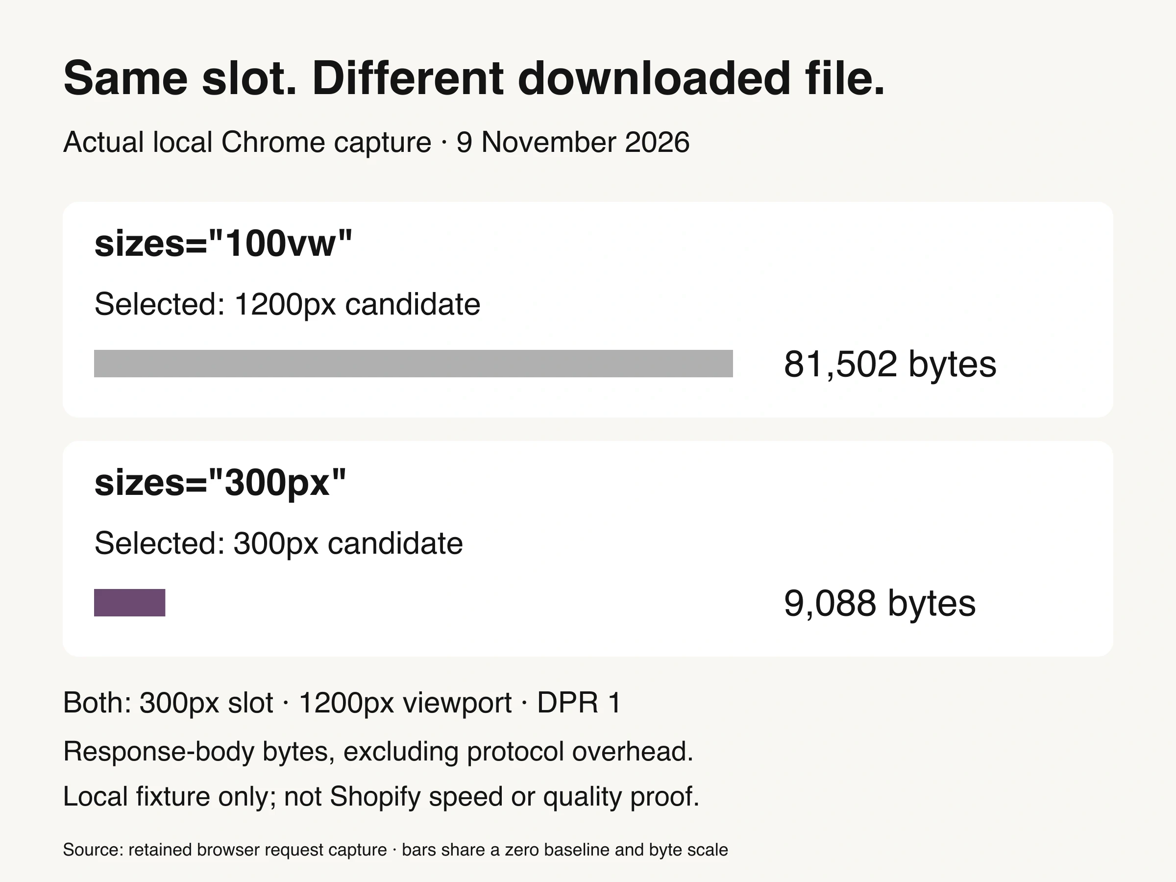
Controlled local Chrome fixture, November 9, 2026. Same 300px slot, 1200px viewport and DPR 1; only sizes changed. Response-body bytes exclude protocol overhead. Not a Shopify speed, conversion or product-quality test.
The visible slot stayed 300 pixels wide. The declared slot changed which file this browser requested. That is why a lighter upload is not the first repair for inaccurate responsive markup. This fixture does not establish adequate detail for a real product, a universal browser choice or the right width for a lightbox.
Chrome’s current Improve image delivery insight covers responsive sizing and format/compression opportunities; the older standalone sizing audit moved into it with Lighthouse 13.
Explicit width and height reserve the image box before the file arrives. This protects layout stability and lets native lazy loading operate with known geometry.
Priority should follow visibility. The likely first-view hero or gallery image should be discoverable early. Later gallery slides and below-fold supports can be lazy. A blanket loading="lazy" rule and a blanket fetchpriority="high" rule are both crude because they erase that distinction.
Inspect the response rather than forcing a format suffix into theme code. Shopify documents browser-compatible WebP and AVIF delivery. A JPEG retained in admin can therefore produce a modern storefront response. The correct test is the response the browser received and the quality it rendered, not whether the source filename ends in .webp.
Compress manually only after the request path is correct
Once the theme requests an appropriate candidate with appropriate priority, source export becomes a clean variable. Compare the current source with one lighter derivative. Keep dimensions, crop, color profile, and sharpening intent aligned so the comparison isolates compression.
Use the product to set the threshold. Smooth studio backgrounds often tolerate a smaller file than hair, knit, fine jewelry, translucent glass, metallic gradients, or labels. Review at the final PDP size and the largest customer-facing zoom. Look for block edges, ringing around type, banding in gradients, smeared texture, color shifts, broken transparency, and halos around the silhouette.
Do not re-export the latest compressed file. Return to the approved master for every derivative. Repeated lossy saves accumulate damage and make rollback difficult. The broader ecommerce photo editing workflow covers catalog-level color, cleanup, and repeatable web export; this page owns the Shopify delivery audit.

Conceptual illustration: compare the product at its real storefront size before accepting a lighter derivative.
If one shoot also supplies marketplace assets, keep the Amazon photography service brief separate from Shopify delivery settings: a shared product master does not imply identical destination exports.
Record the accepted derivative beside the source hash or asset ID, intended placement, viewport checks, and reviewer. That turns “looks fine” into a reproducible release decision. It also prevents a later batch job from replacing the approved product image with a smaller but visibly weaker export.
Treat alt text as product information, not compression
File delivery and image meaning are separate jobs. Alt text does not make an image lighter, but it makes the product media understandable when the image is unavailable and for shoppers using assistive technology. Shopify's alt-text guidance recommends brief, descriptive text. Google's image SEO guidance says it uses alt text with page context and computer vision to understand an image.
Describe what the image contributes: product, color, view, material, and relevant visible feature. Do not turn every angle into the same keyword string. Decorative imagery can use empty alt text when the implementation and accessibility review support that choice; product evidence needs a useful description.
Use short descriptive filenames upstream for asset management and search context, but do not confuse naming with performance. A perfect filename cannot repair an oversized request or a late LCP image.
Where Look Atlas fits
Image optimization begins before export because the source needs enough honest product detail to survive responsive delivery. Look Atlas can extend approved product imagery into studio, lifestyle, on-model, and campaign-oriented visuals. Those outputs should enter the same Shopify audit as conventional photography: one retained source, one named placement, responsive delivery, and a product-detail threshold.
Generated context does not justify invisible product damage. If a lighter derivative softens trim, changes a label edge, or hides material texture, keep more detail or choose a less demanding placement. The final asset still has to represent the item being sold.
Finish with a two-viewport release record
For each repaired template, keep one short record: page URL, image job, desktop and mobile rendered widths, chosen currentSrc, transferred bytes, loading behavior, visual decision, and the change made. Include the before values so a later theme update can be checked against the same evidence.
Then stop. Do not install another optimizer because a generic score remains imperfect. The job is complete when the storefront requests a sensible candidate at the right time, the product survives the delivered derivative, and the change improves the measured page without shifting the problem elsewhere.
