Shopify product picture size: use 2048 px, then check your theme
For a square Shopify product picture, start at 2048 × 2048 pixels. Shopify says that size usually displays best for square product images. It is a practical default, not a command to make every catalog square and not permission to upload the largest file the platform accepts.
The right production spec has four parts: source dimensions, aspect ratio, compressed file weight, and the image your theme actually delivers. Get only the first one right and a product can still look cropped, soft, or unnecessarily heavy.
The quick answer depends on the frame
Use 2048 × 2048 pixels when your featured product images and product-detail gallery are square. If your theme is intentionally portrait-first, keep that ratio consistent and size the source from the widest real display slot. A clean 1600-pixel source is also better than an artificially enlarged 2048-pixel file with invented detail.
The table below is a starting spec, not a substitute for previewing the live theme.
Store setup | Starting export |
|---|---|
Square catalog | 2048 × 2048 px |
Portrait-first fashion | 2× widest slot at one fixed ratio |
Small original | Keep native detail; do not upscale |
Multi-channel catalog | Meet the strictest verified destination |
Use the square recommendation by default, then let the live theme and destination rules justify exceptions.
For example, if a portrait product image never renders wider than 900 CSS pixels, a 1800-pixel source width is a defensible working point. At a 4:5 ratio, that becomes 1800 × 2250 pixels. This two-times-slot method is Look Atlas analysis for production planning, not a Shopify rule.
Shopify's maximum is a guardrail, not an export target
Shopify's current product media documentation accepts product and collection images up to 5000 × 5000 pixels or 25 megapixels, with each upload smaller than 20 MB. The same page recommends 2048 × 2048 pixels for square product images.
Those numbers answer different questions. The 5000-pixel and 25-megapixel figures describe what Shopify will accept. The 2048-pixel figure describes what usually displays well for a square product image. A 2048 × 2048 file contains about 4.2 megapixels, so it already carries substantial detail without approaching the platform ceiling.
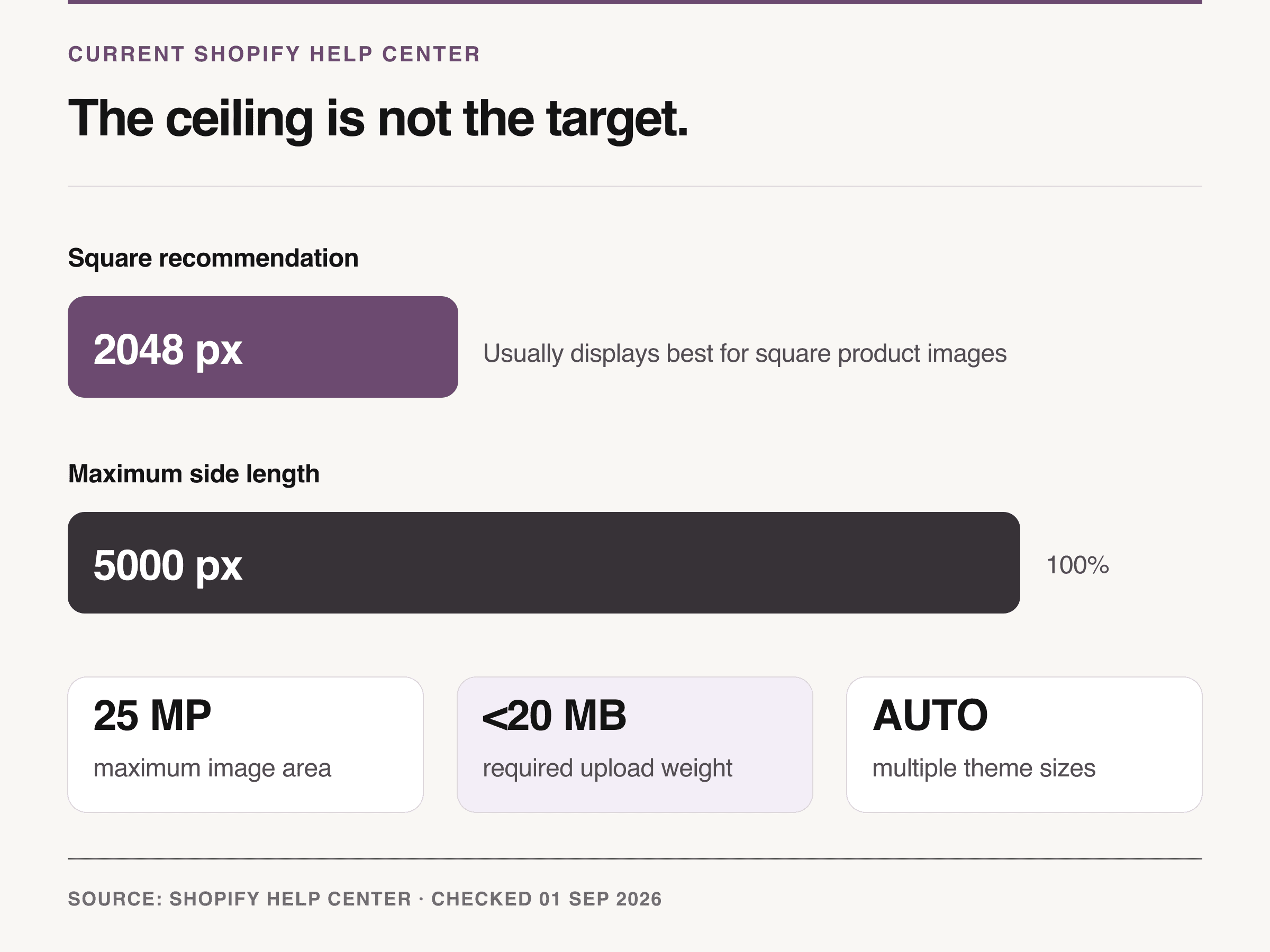
Source: Shopify Help Center, Product media types, checked September 1, 2026. The chart separates the 2048 px square recommendation from the 5000 px upload ceiling.
Treat the maximum as headroom for unusually detailed source material, not as a daily export preset. Uploading a 5000-pixel file does not force a browser to show more useful detail. It gives the theme more source data, which can be valuable or wasteful depending on what the theme requests.
Aspect ratio decides the crop before pixels decide sharpness
A 2048-pixel image can still fail if its shape does not match the frame. Shopify advises using a consistent aspect ratio for featured images when products appear side by side. That consistency is what keeps a collection grid from alternating between tall, short, and awkwardly cropped cards.
Choose the catalog shape from the merchandising job:
1:1 square is the safest general-purpose system for mixed products, collection cards, related-product rows, and adaptable PDP galleries.
4:5 portrait gives apparel, models, and tall products more vertical room, but the theme must preserve that choice across cards and galleries.
Landscape can suit furniture or wide objects, yet it often spends less mobile screen area on the product and needs a deliberate theme treatment.
Do not change the featured-image ratio SKU by SKU because one source photo is inconvenient. Keep alternate angles flexible only if the product gallery handles mixed ratios without shifting, clipping controls, or changing the product's apparent scale.
A slot-first method beats copying a cheat sheet
The useful question is not “How large can I upload?” It is “How wide can this image render, and what does the shopper's browser receive?” Use the following sequence before you batch-export a catalog.
1. Read the widest real product-media slot
Open a representative product page at desktop width and again at a narrow mobile width. Inspect the main image element in browser developer tools. Record its displayed width and the file listed in currentSrc, then repeat for a collection card and an expanded or zoomed product view.
The largest meaningful product view sets the detail requirement. A thumbnail does not. A full-window lightbox might.
2. Lock the aspect ratio and safe crop
Select the square, portrait, or landscape behavior in the theme before asking a studio or generator for final files. Preview a wide product, a tall product, and a small product inside that same frame. If important edges disappear, fix the framing system instead of adding pixels.
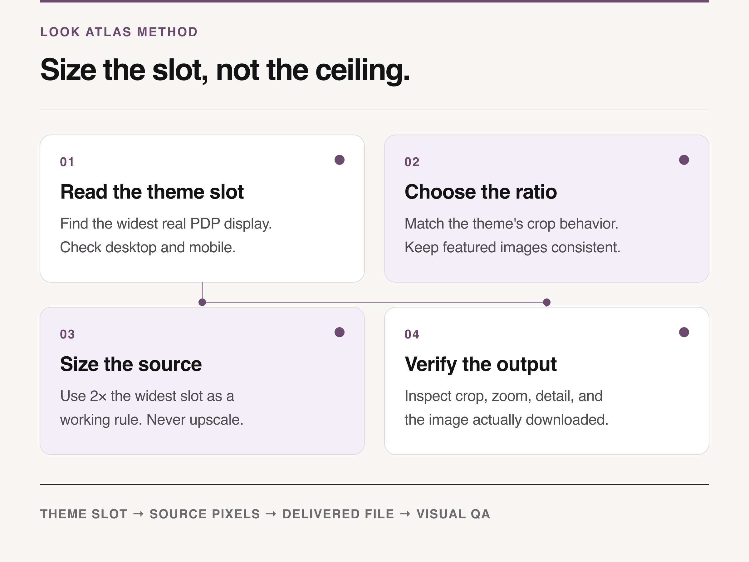
Look Atlas method: read the theme slot, choose the ratio, size the honest source, and verify the delivered image.
3. Size the source without inventing detail
As a Look Atlas working rule, export at twice the widest normal display width when the original contains enough real detail. Stop at the source's honest resolution and stay inside Shopify's boundaries. Enlarging a soft image changes its pixel count, not the product information it contains.
4. Verify the delivered image, not the filename
Resize the browser and watch currentSrc change. Check the product at normal view and zoom, then inspect texture, labels, edges, hardware, and small type at 100%. The approved file is the one that survives the actual theme, not the one whose name ends in 2048-final.
Compression should fail on the product, not a magic number
Shopify's product-photography guide suggests aiming for no more than 200 KB and warns that excessive compression can look blotchy. Shopify's broader 2026 image guide uses roughly 300 KB as a product-photo reference. That difference is a useful reminder: file weight is a budget to test, not a quality certificate.
Start aggressively on simple, opaque products with clean backgrounds. Give more room to knit, hair, gemstones, translucent packaging, fine gradients, or labels when a smaller file visibly damages the product. Compare exports at the final PDP size and on a phone before approving the lighter one.
Shopify accepts PNG, JPEG, WebP, and several other source formats. Its Imagery service then selects a compatible delivery format for the shopper's browser. Preserve what matters in the source: use an efficient photographic format for opaque photos, and keep lossless edges or transparency only when the product actually needs them.
The theme decides what the shopper downloads
Shopify automatically creates different image sizes for different theme contexts. That does not absolve the theme. Shopify's current responsive-layout guidance calls the sizes attribute a key lever because it tells the browser how wide an image will render and lets it choose a sufficient candidate from srcset.
If sizes is missing or inaccurate, a two-column product grid can download an image meant for a much wider slot. A merchant may see a correctly compressed master in the admin while shoppers still receive an oversized derivative. Check currentSrc on the live theme. If the delivered width is far above the displayed width across ordinary devices, the theme needs attention, not another round of source compression.
Build crop safety into the source image
Leave enough clean background around the product for the chosen square or portrait frame to breathe. The goal is not a fixed percentage. The goal is to preserve the full silhouette and comparable product scale across a collection while keeping the item large enough to inspect.
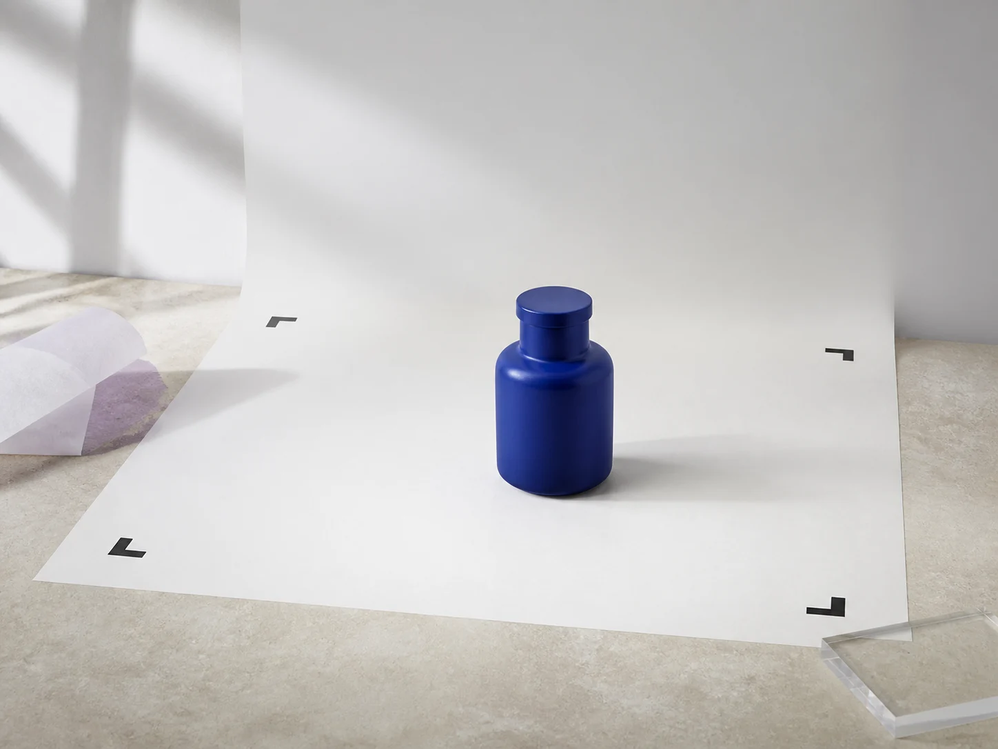
Conceptual illustration: a crop-safe source leaves enough clean space to preserve the complete product across the chosen frame.
Test the first export set as a contact sheet. Product tops, handles, hems, and shadows should not touch the frame by accident. Small products should not float at half the visual scale of neighboring items. Once the crop rule works across the hardest SKUs, record it in the product photography workflow so capture, retouching, and export use the same boundary.
Do not shrink below another channel's requirement
A Shopify catalog often feeds more than the storefront. Google Merchant Center currently says product images will need to be at least 500 × 500 pixels from January 31, 2027, and it recommends 1500 × 1500 pixels or larger for performance across listing formats. The current image-link specification should be checked again when that rule takes effect.
That does not mean every source must be square. It means a shortcut designed for one small theme slot can make the same asset unsuitable downstream. If Amazon production is also in scope, treat it as a separate specification and brief rather than assuming Shopify's default covers it; the Amazon photography service guide explains that broader production decision.
Where Look Atlas fits after the master is locked
Once the source image, crop boundary, and export rules are approved, Look Atlas can create generated studio, lifestyle, campaign, and on-model derivatives from product imagery. Keep those outputs inside the same sizing system. A new scene still needs the correct ratio, a product-safe crop, honest detail, and a delivered-file check.
The product master remains the reference. Generated derivatives expand the visual set; they do not authorize a new color, shape, label, material, or proportion.
Run this five-minute release check
Before uploading a batch, confirm:
The featured-image aspect ratio matches the live collection and PDP design.
The source is at least twice the widest normal slot when real detail allows it.
Square defaults use 2048 × 2048 pixels unless the theme test justifies another size.
No file exceeds 5000 × 5000 pixels, 25 megapixels, or the under-20-MB upload rule.
Compression preserves texture, edges, labels, gradients, and color.
Mobile and desktop crops keep the complete product visible at a consistent scale.
currentSrcis proportionate to the displayed slot, and zoom reveals real rather than invented detail.
If all seven pass, the image is ready for this theme. If one fails, fix the ratio, source, compression, or responsive delivery layer that caused it. “2048 pixels” is the starting answer. The rendered product is the final one.
