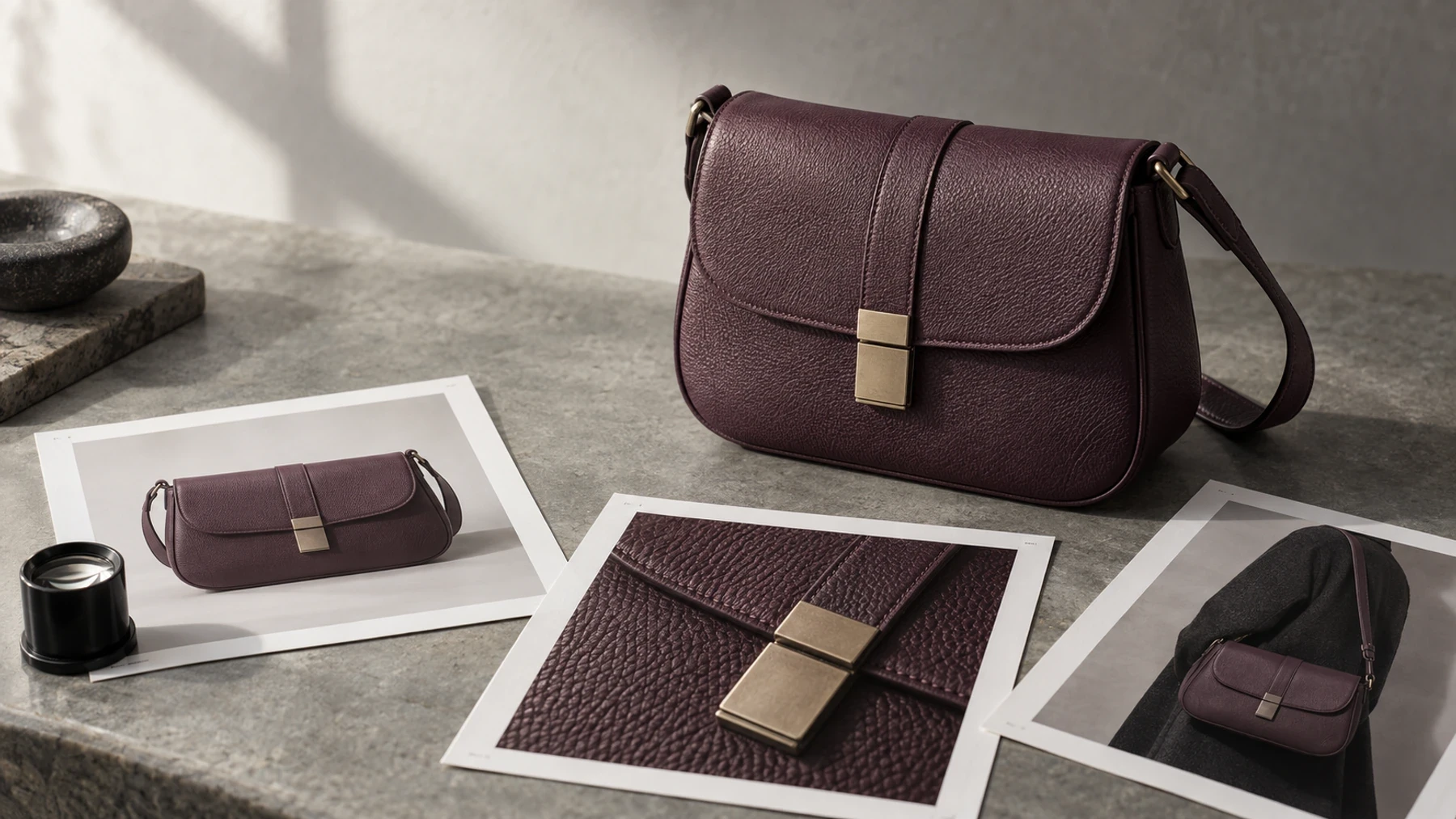
Product Page Images: Build a Gallery That Answers Buying Questions
The best product-page image set is not the one with the most frames. It is the smallest gallery that lets a shopper identify the product, inspect what matters, judge scale or fit, understand use, and verify the exact variant. A fifth useful image beats a tenth near-duplicate.
That changes the production question from “How many images do we need?” to “Which buying decision can the shopper not make yet?” The answer produces a gallery you can brief, audit, and improve without copying a competitor's shot count.
Start with missing answers, not a universal image count
Every frame should retire one source of uncertainty. Begin with a clean identity view, then add only the evidence this product category needs. A bottle needs label and dispensing detail. A bag needs interior capacity, hardware, and worn scale. A chair needs construction, upholstery texture, underside detail, and an in-room reference.
Use this two-column map before writing a shot list. It is deliberately a coverage tool, not a prescription that every product needs six images.
Buyer question | Image evidence to provide |
|---|---|
What exactly will arrive? | Clear identity view of the correct product and variant |
What can I not see from the front? | Rear, side, interior, underside, closure, or included items |
What does the material or finish look like? | Close detail with enough resolution to inspect texture and construction |
How large is it or how will it fit? | Human, room, hand, or familiar-object scale reference plus written dimensions |
How does it work in context? | Honest use view that keeps the product and relevant action visible |
Which version am I choosing? | Variant-specific frame matching color, pattern, material, and included parts |
Treat the table as a coverage check, not a universal six-image prescription.
This is the first release rule: two frames that answer the same question are competing for space. Keep the stronger one unless a different angle reveals new construction or fit information. If a beautiful lifestyle image obscures the feature it is meant to explain, it is campaign art, not product evidence.
For a production-ready specification, move each selected job into a product photography shot list with the exact SKU, crop, protected product facts, destination, and observable pass condition.
Sequence the gallery from recognition to inspection
A useful gallery has a reading order. The first frame establishes identity. The next frames reduce the largest category-specific risks. Context comes after the shopper has seen enough factual evidence to recognize what is being styled.
The sequence is not rigid. For apparel, worn fit may deserve the second slot. For a small electronic device, ports or controls may matter before a room scene. The principle is stable: show the product, answer the highest-risk question, then widen into context.
Put the strongest alternate view early enough to be discovered without effort. Baymard's mobile research found that thumbnails made additional images easier to identify and target than dots or text indicators. If the gallery hides ten useful frames behind ambiguous controls, the production team solved the wrong problem. Baymard's recommendation is to use thumbnails and visibly signal that more images continue beyond the current viewport.
The image order should also follow the selected variant. If a shopper chooses green, do not leave the hero green and the detail views black unless the interface makes the relationship unmistakable. Google's current product-data guidance says submitted images should match the product's color, pattern, and material attributes. That channel rule exposes a broader truth: variant drift damages confidence wherever the image appears.
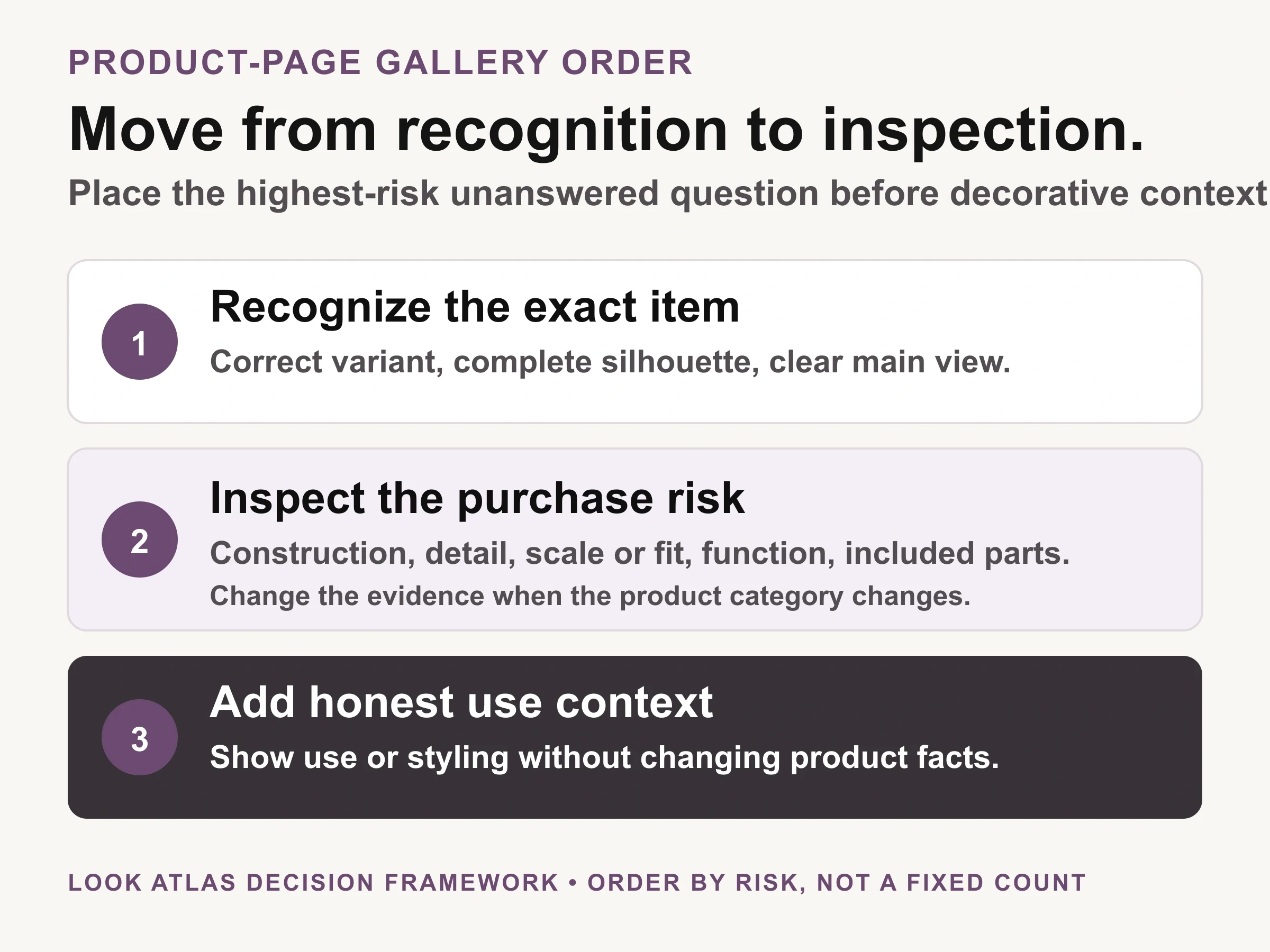
Look Atlas decision framework: order the gallery by the highest-risk unanswered question, not by a fixed shot count.
Build a factual core before styling the story
Start production with frames that could settle a return dispute: the exact variant, full silhouette, alternate construction, material detail, included parts, and an honest scale cue. Approve those views before adding a scene whose primary job is mood.
The identity image should be boring in the useful sense. Its job is clarity. Google's Merchant Center guidance recommends a clear main view with minimal or no staging, a solid white, gray, or light background, and no promotional overlay or border. Google also says the image should accurately display the product. These are feed requirements, not a command that every storefront image must use a white background, but they make an effective factual baseline.
Then decide what “detail” means for the SKU. Do not schedule a generic close-up. Name the evidence: leather grain and edge paint, knit density and seam finish, stone setting and clasp construction, control labels and ports, or ingredient panel and dispensing mechanism. The feature named in the brief must remain sharp at the zoom level the page actually provides.
If the product includes several pieces, photograph the confirmed pack-out once as a complete set. If accessories shown in context are not included, say so beside the image rather than expecting composition alone to communicate the boundary.
Change the set when product risk changes
The required gallery is a function of product risk. Apparel carries fit, drape, opacity, and length questions. Jewelry carries scale, surface, stone, setting, and clasp questions. Home goods carry room scale, material, assembly, and access questions. Cosmetics may require package size, texture, applicator, shade, and legally accurate label detail.
This is why “seven images per product” is weak policy. A plain replacement cable may be fully explained by fewer frames than a convertible bag with multiple compartments. Set a catalog baseline, then define exception families. The baseline keeps the store coherent; the exceptions keep difficult products truthful.
Audit the hardest SKU in each family first. If a black garment loses its edge, a reflective metal surface changes color, or a tiny closure cannot be inspected on mobile, repair the capture and page behavior before multiplying the failure across the catalog. The professional product photography guide covers lighting and capture fundamentals. The Shopify image optimization workflow addresses what the browser downloads after the source image is approved.
Let context extend the evidence, not replace it
Lifestyle and on-model images can answer scale, use, styling, and emotional-fit questions that an isolated frame cannot. They become misleading when the product quietly changes to make the scene prettier.
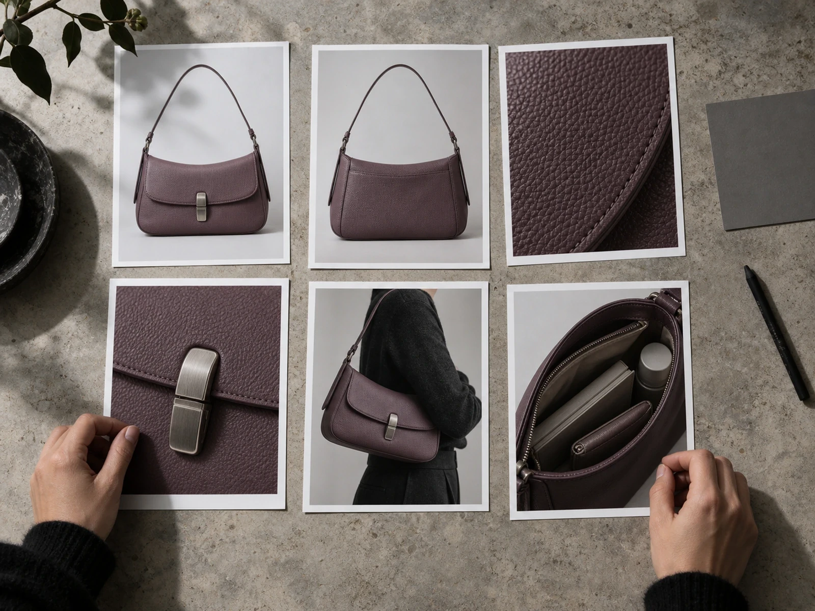
Conceptual illustration: a fictional bag shown as identity, alternate, texture, hardware, worn-scale, and interior views. It is not a customer shoot or controlled outcome.
Review contextual frames against the factual core. Compare silhouette, proportion, color, material response, hardware, labels, included pieces, and the way the product sits on or beside a known reference. For generated scenes, preserve the source images and record what must not change. Treat the result as a proposed product image until a human approves those facts.
Context can also reveal function. An open bag can show capacity, a chair in a room can establish scale, and a jacket in motion can show drape. But one frame rarely proves everything. Pair the contextual image with the written measurement or specification it helps interpret.
The caption should disclose when an image is conceptual or digitally created if a shopper could otherwise mistake it for documentary evidence. Honesty is part of the visual system, not a legal footnote tucked elsewhere on the page.
Make the files survive the page
Once the set is selected, protect its usefulness through delivery. Keep a high-quality master, export for the actual display slots, and verify that responsive delivery does not turn an inspectable texture into blur. Shopify's current product-page guidance calls for identifiable product images with a zoomed-in view and recommends combining neutral-background and lifestyle images.
Use concise literal alt text for informative images. Describe the visible product and view, such as “Plum leather shoulder bag open to show one zip pocket and two slip compartments.” Do not use the alt field to repeat a sales claim or stuff the product name. Decorative campaign imagery can use an empty alt value when it communicates no information beyond adjacent text, but the decision should be intentional.
Keep image URLs stable when the product has not changed. Google's Merchant Center guidance recommends stable image URLs and says to update the URL when the actual product image changes. Whatever your platform, a replacement should preserve the connection among SKU, variant, source master, derivative, and page slot.
Run one final device check on the rendered product page: correct variant, deliberate order, discoverable thumbnails, sharp enlargement, no crop that removes a critical feature, and no image pushing the primary buying controls into an unusable layout.
Inspection matters more than polish alone
Product images are working evidence. Baymard reports that 56% of participants' first action in its product-page usability testing was to explore product images. Its research also found that 42% of users tried to determine product size from product-page imagery. In a separate benchmark finding, 25% of ecommerce sites provided insufficient resolution or zoom for visual evaluation.
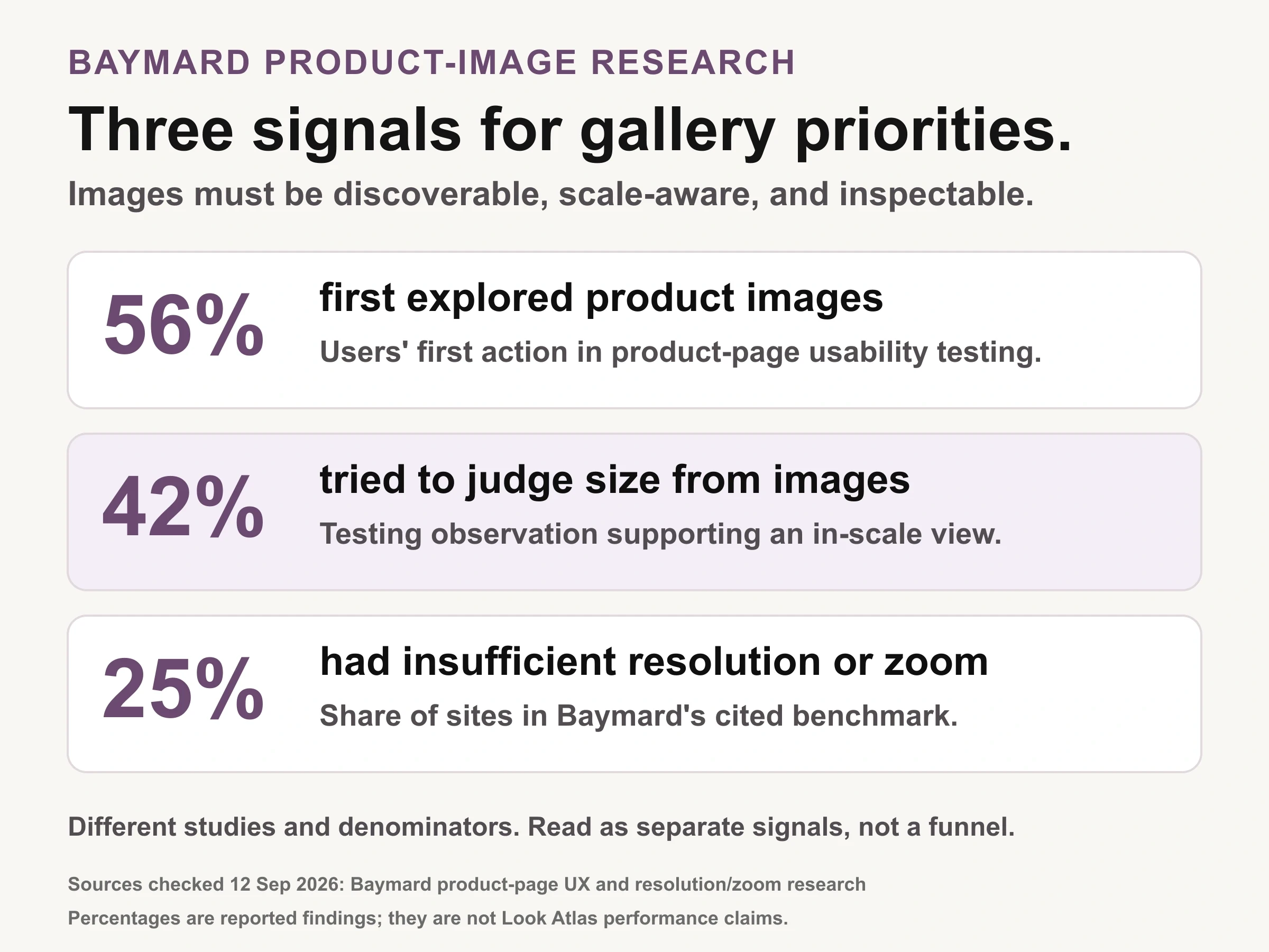
Sourced evidence chart: Baymard product-page research. The percentages come from different observations and denominators, so they are separate signals rather than a funnel.
Those percentages describe different observations and should not be added together. Their shared lesson is practical: a gallery must support recognition, scale judgment, and close inspection. High-resolution files are wasted if the interface cannot reveal them; elegant controls are wasted if the underlying detail turns soft when enlarged.
Check the delivered experience, not just the source folder. On desktop, open the largest view and inspect the exact feature the image exists to show. On mobile, test pinch or tap behavior, thumbnail discoverability, swipe order, and the resolution fetched during zoom. Baymard observed product abandonment when people could not inspect important details, and recommends fetching a higher-resolution version when mobile users begin zooming.
Scale deserves its own frame whenever physical size affects the decision. Written dimensions remain necessary, but they do not replace visual comparison. A handbag on a person, a lamp beside furniture, or a device in a hand helps a shopper interpret those dimensions. Keep the reference truthful: do not resize the product within a generated or composited scene simply to improve the composition.
Use Look Atlas after the factual source set is approved
Look Atlas is relevant when an ecommerce team has approved product inputs and needs additional product-on-model, studio, lifestyle, or campaign-style imagery. The safe handoff includes the source set, the intended gallery job, the target crop, and a short list of product facts that cannot change.
Generated context is strongest as an extension lane, not as permission to discard product evidence. Keep at least one factual identity frame and the category-specific details a shopper needs. Review generated outputs against the exact variant before they enter the gallery. The product may look at home in a new scene while still failing on strap length, closure shape, logo placement, or material finish.
Do not promise that an attractive generated frame will improve conversion. The defensible test is narrower: choose one high-traffic product family, define the missing buyer question, add a frame designed to answer it, and compare behavior without changing several other page elements at the same time.
Release the gallery only when every frame earns its place
Take one representative SKU and label each current image with the buyer question it answers. Remove genuine duplicates. Mark missing identity, construction, detail, scale, use, or variant evidence. Then inspect the result on the actual desktop and mobile product page.
The gallery is ready when a shopper can recognize the exact item, inspect its important details, understand its physical relationship to the world, and find every supporting view without guessing. That is a better standard than a universal image count, and it gives the next production cycle a precise repair list.
