
Social media product photography: plan the question, crop, and variant
“Make it scroll-stopping” is not a usable photography brief. It says nothing about what the buyer must understand, where the image will appear, or which creative decision the team wants to test.
A stronger social media product photography system makes three choices before the shutter fires: the buyer question the image will answer, the destination frame it must survive, and the one creative lever that may change. Product color, shape, label, material, offer, and landing destination stay fixed.
That discipline does not guarantee clicks or sales. It does make the work truthful, reusable, and possible to evaluate.
Start with the question the buyer still has
A photograph earns its place by resolving uncertainty. “We need five posts” describes a quantity. “Show how this bag sits against the body” describes an assignment.
The useful questions are often plain: How big is it? How is it used? What is included? What does the surface feel like? Will it suit a real person or space? Baymard's current product-page UX research reports that 42% of users try to establish product size from product images, which is why at least one in-scale view matters beyond the product page. A social crop can introduce that evidence, while the destination page supplies the complete set.
Buyer question | Photograph that answers it |
|---|---|
How big is it? | Show it on a person or beside a familiar object |
How is it used? | Capture the real action at the useful moment |
What does it feel like? | Use a close detail with honest texture and light |
What is included? | Arrange the complete kit with every item visible |
Will it suit me or my space? | Show one credible context without hiding the product |
Each social asset gets one primary buyer question before capture.
Assign one primary question to each asset. A frame may answer a second, but it should not try to prove scale, texture, use, contents, and lifestyle fit at once.
Photograph a master that survives the crop
Begin with a truthful master, not a finished Instagram rectangle. Capture enough clean area around the product to derive the planned frames, while keeping enough resolution for the tightest useful crop. Record an uncluttered version before adding props or copy space.
For each setup, make four checks:
Silhouette: the complete product remains readable against the background.
Evidence: the feature that answers the buyer question is large enough to inspect.
Crop room: important edges, hands, shadows, and packaging are not trapped at the boundary.
Truth: color, proportions, texture, label, and included pieces match the sale item.
Overscan is insurance, not a license to frame carelessly. A source that is too wide can turn the product into a thumbnail when cropped vertically. Some assignments need a second camera position: one composition for square or 4:5 placements and another for 9:16. Make that decision at capture, before a designer is asked to rescue missing space.
One master needs several destination frames
There is no universal “social size.” Current official guidance illustrates the conflict. LinkedIn recommends a 4:5, 720 × 900 px vertical single-image ad. Pinterest recommends 2:3, 1000 × 1500 px for a standard image ad and warns that taller images may be cut off in feeds. TikTok recommends 9:16 at 540 × 960 px or greater for vertical in-feed video.
Those are placement specifications, not quality or performance promises. They also change. Check the live destination rules when the asset is exported, and store the check date in the job record.
The efficient approach is to preserve one approved master and create named derivatives for each planned placement. Do not repeatedly crop the most recent export; every derivative should trace back to the same source. A crop of a crop quietly loses resolution and shifts composition.
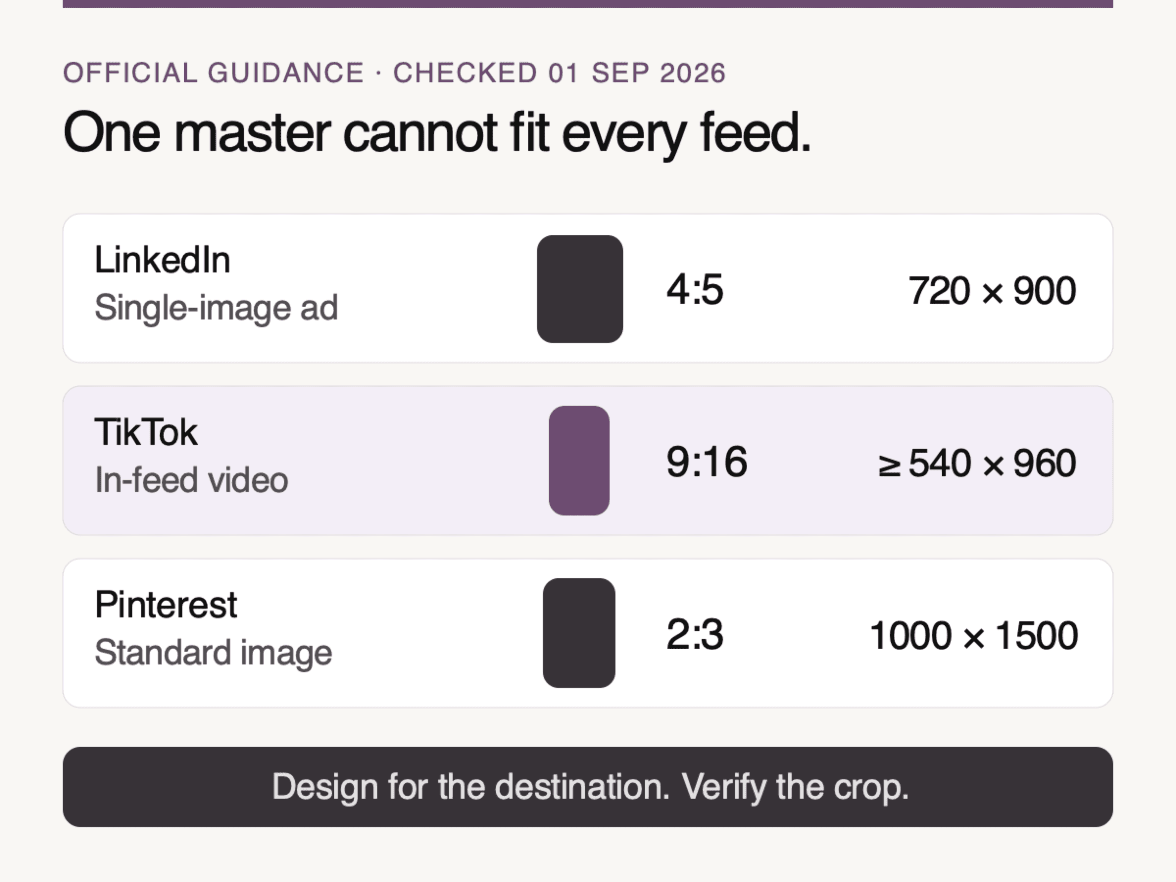
Sources: LinkedIn Help, TikTok for Business Help, and Pinterest Business Help, checked September 1, 2026. These are placement recommendations, not performance promises.
Keep the product inside the useful frame
Aspect ratio is only the outer boundary. Interface controls, captions, profile marks, buttons, and device behavior can cover part of the image or video. TikTok says its safe zone varies with dimensions, caption length, and additional formats. Meta likewise directs Reels advertisers to keep key elements inside the safe zone for the 9:16 placement.
Treat the safe zone as a preview check, not a permanent transparent template saved over the master. Export the derivative, load it into the actual placement preview, and inspect it on a narrow phone. Confirm that:
the product and its evidence remain visible without opening the post;
text added by the platform does not cover the label or use moment;
the first frame still works when sound is off;
a carousel does not change product scale unpredictably from card to card;
a paid-placement crop does not imply a different package, quantity, or feature.
If the platform preview forces a damaging crop, return to the source composition or make a dedicated frame. Smaller type and tighter trimming are not reliable repairs.
Lock product truth before you multiply variants
Variation becomes useful only after the fixed elements are explicit. Lock the product's color, material, shape, label, proportions, included items, approved claims, offer, and landing destination. These are controls, not creative options.
Then choose one lever to vary:
Buyer question: scale versus use, provided each version has a distinct assignment.
Scene: pale stone versus a credible room, with the product unchanged.
Crop: 4:5 versus 9:16 for different placements, not as a claim that one performs better.
Hook: the opening line or first-frame emphasis.
Prop family: one restrained context cue, not a new story around the item.
This distinction matters for photography, retouching, and generated scenes. If the “variant” also changes the bottle color, label, background, offer, crop, and headline, a result cannot explain which choice mattered. Worse, the image may no longer represent the item on the product page.
A useful creative variant changes one thing
Make a variant pair only when both versions are good enough to ship. A deliberately weak control wastes traffic and teaches little. Keep audience, offer, destination, placement, and measurement window aligned when the test design allows it, then change the selected creative lever.
Shopify uses close-up versus in-use imagery as an example of a visual A/B test. TikTok's current Experiment Manager asks advertisers to choose two campaign variants, test dates, a key metric, and enough estimated testing power. Its report can return a winner or no winner.
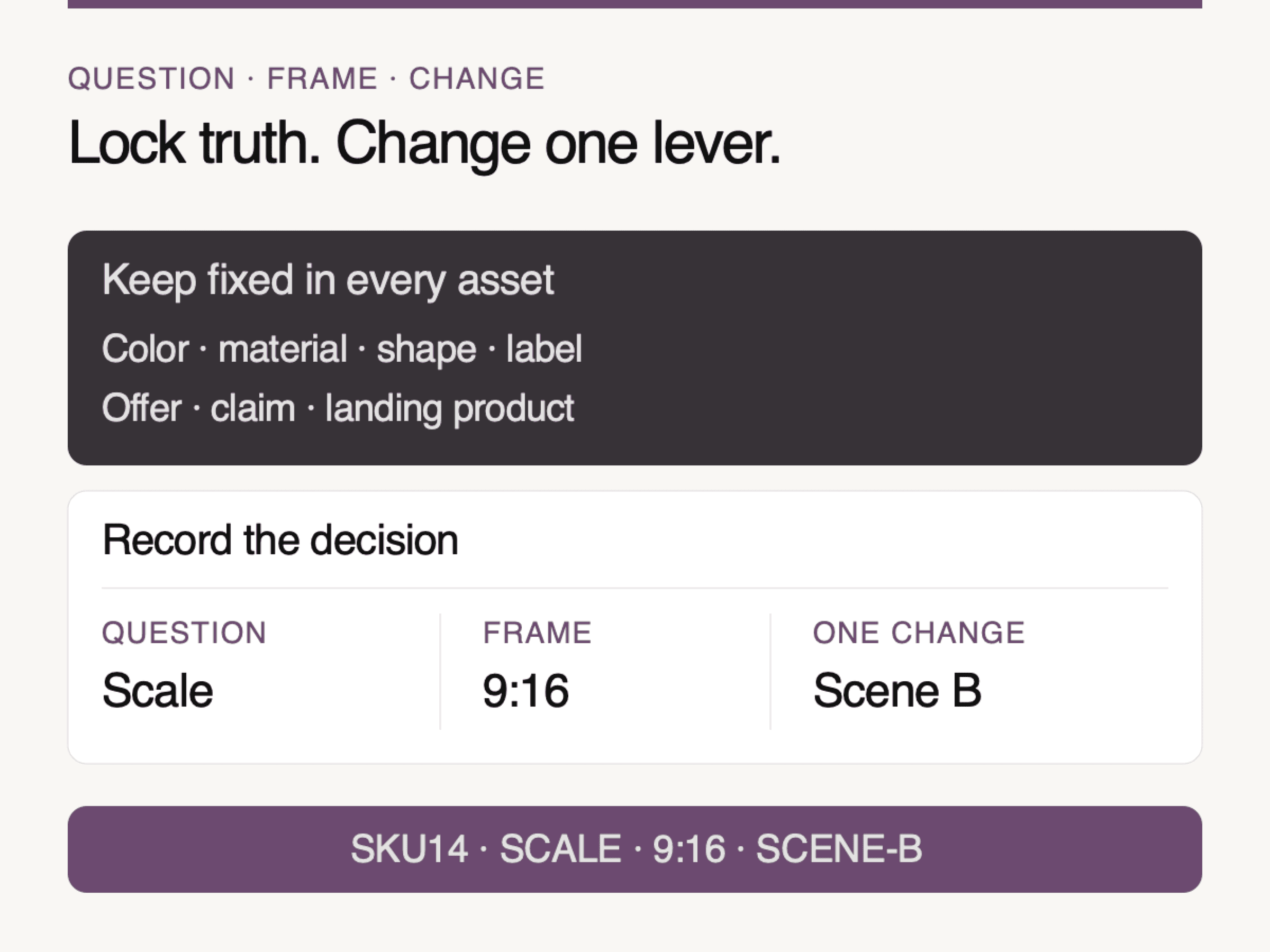
Look Atlas method: lock product truth, then change one buyer question, placement frame, or creative lever at a time.
That last outcome is important. A test is not a machine for validating the team's favorite image. Results belong to the account, audience, offer, placement, and period in which they were observed. Record them without turning one campaign into a universal rule.
Name the asset before the result exists
A filename should identify the creative decision, not celebrate an outcome that has not happened. A practical pattern is:
SKU14-SCALE-916-SCENE-B
That record can be read without opening the file:
SKU14: the sale item;SCALE: the buyer question;916: the destination frame;SCENE-B: the single creative treatment.
Beside the asset ID, record the master source, capture date, placement, safe-zone preview, landing URL, key metric, test dates, and decision. Use “no winner” when that is what the evidence says. Never rename the losing file “bad”; it may answer a different question or work in a different placement.
This question, frame, change record is a Look Atlas operating method. It turns a folder of attractive exports into an explainable creative system.
The product page must finish the same promise
The social image and product page do not need to be identical, but they must agree. TikTok's ad-review guidance requires the product in the creative to be consistent with the product shown on the landing page. The same check is sensible for any channel.
Before release, compare the derivative with the destination and ask:
Is the same color or variant selected and available?
Is the featured material or function visible on the page?
Are the quantity, accessories, and package contents the same?
Does a lifestyle scene imply an included item that is actually only a prop?
Can the buyer find the scale, texture, angle, or fit evidence introduced in the social post?
If the campaign depends on real context and you do not yet have a credible source set, use the lifestyle product photography services guide to decide whether to commission a studio, location, or hybrid production. The choice comes before the derivative system.
Generated scenes belong inside the same control system
Generated imagery can expand an approved scene family, but it does not loosen the truth standard. Start from a reference that clearly shows the real product. Reject changes to color, finish, silhouette, label, proportions, fasteners, seams, hardware, or the relationship between the product and the person using it.
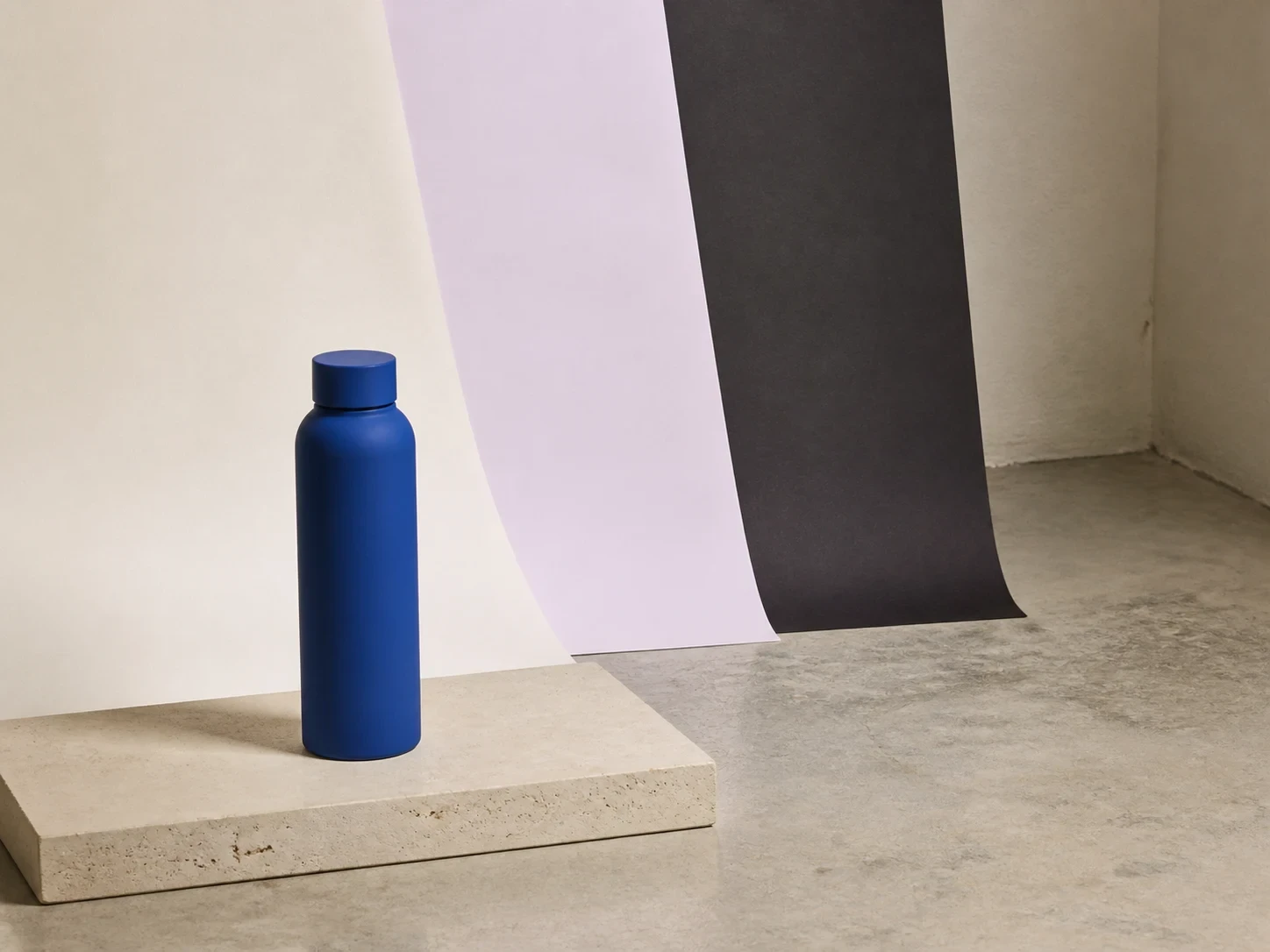
Conceptual illustration: hold the product and camera logic fixed while changing one approved scene treatment.
A useful generated set may hold the product and camera logic fixed while changing one background treatment. Review each output beside the source at 100%, then export the required placement derivatives from the accepted result. The visual above illustrates that controlled scene idea; it is not evidence of a real campaign or a winning treatment.
Once that control system exists, Look Atlas can turn product photos into on-model, PDP, and campaign-ready visual content. The same question, frame, and truth checks still apply. Generated volume is valuable only when every approved file remains recognizable as the item a customer can buy.
Use this seven-line brief for the next shoot
Write this before capture or generation:
SKU and landing URL: the exact sale item and destination.
Buyer question: one uncertainty this asset must resolve.
Truth locks: color, material, shape, label, contents, claim, and offer.
Source plan: master ratio, alternate camera position, and honest detail requirement.
Destinations: exact placements, current ratios, and safe-zone previews.
Creative lever: the one scene, crop, hook, or prop decision allowed to change.
Record: asset ID, dates, metric, result, and next decision.
That is enough to replace “make five social posts” with a production assignment. Start with the buyer's question. Frame it for the destination. Change one lever. Let the result inform the next asset without allowing the product promise to drift.
