
Product photography composition: choose what gets the space
Raise the camera above a package and its lid becomes easier to see, while the front panel occupies less of the image. Moving the product onto a rule-of-thirds line cannot recover the face that the viewpoint has compressed. For product photography composition, decide how the important surfaces should share the frame before arranging the empty space around them.
This guide works through that decision with a deliberately simple rectangular tin. The example is a controlled geometric render, not a photographed product or a test of customer preference. It shows one useful trade-off, then turns it into a practical way to compose a product on a tabletop.
Give the frame one primary surface to explain
Start with the actual product on a plain surface, the camera supported, and enough light to inspect its edges. Name the surface this image must make prominent. For a labeled tin, that might be the front panel. For a container with a distinctive closure, it might be the lid. “Show both” is a reasonable request, but it does not say which should have priority when the camera cannot give them equal prominence.
Make the decision observable: “Keep the front panel broad enough to inspect, with the lid visible as a secondary feature.” Alternatively: “Show the lid shape clearly, accepting a shallower view of the front.” These are different compositions of the same object, not different styling moods.
Adobe's perspective guide describes how changing vantage point reveals different geometric relationships. In product work, use that freedom deliberately. Before trying a diagonal arrangement or adding a prop, inspect what the camera position makes large, compressed or hidden.
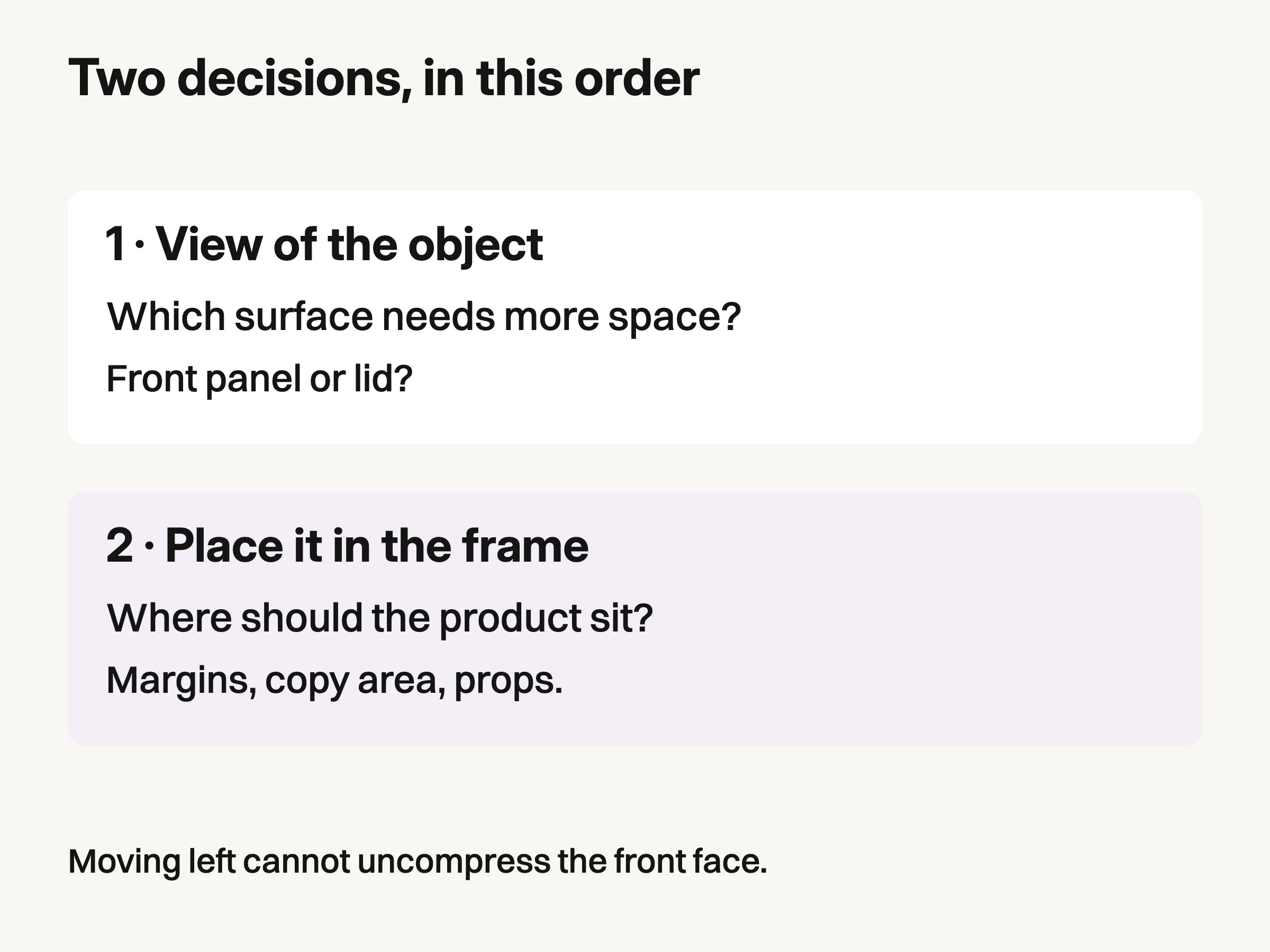
Original composition aid: choose the surface allocation first, then the position in the frame.
You do not need to calculate angles on every shoot. Begin near the height of the feature, then raise the camera gradually while keeping the product steady. Look through the camera rather than judging from beside it. Stop when the secondary surface becomes useful, and check what the primary one has lost.
See the front-to-top trade-off in a controlled example
We built one schematic tin and rendered it from elevations of 15 and 60 degrees above horizontal. The camera remained eight scene units from the same target. Geometry, materials, light positions and orthographic projection scale stayed fixed. Orthographic projection removes distance-related size changes from this example; it is not a simulation of a particular photographic lens.
The pale front patch is 1.5 units wide and 1.2 units high. In the original 900 × 650 captures, its projected width stays about 216.7 pixels. Its projected height changes from about 167.4 pixels at 15 degrees to 86.7 pixels at 60 degrees. These dimensions were calculated by projecting the known patch coordinates through the actual rendering camera.
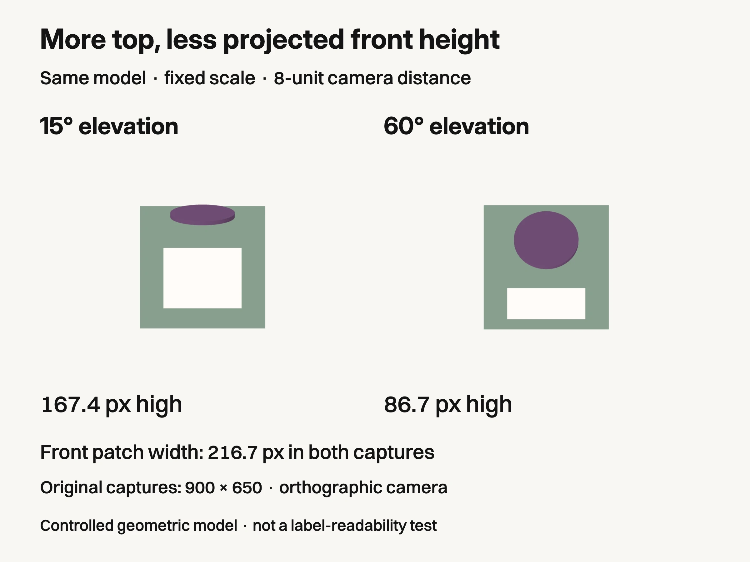
Controlled geometric example: same modeled tin, light and orthographic scale; camera-target distance 8 units. Patch heights refer to original 900 × 650 renders. No physical product, label readability or sales outcome was tested.
The higher view exposes more of the top while compressing the front patch vertically. The object itself has not become shorter, and no label was resized between frames. This is a change in how its surfaces project into the image.
That result supports a narrow composition decision. If the front panel carries the main visual information, a much higher view may spend too much of the frame on the top. If the lid design is the subject, that allocation may be exactly what is needed. Neither angle is universally better.
The patch contains no text, so the example does not establish label readability. It also says nothing about real packaging accuracy, reflections, sharpness or sales. A real camera introduces perspective, and a curved bottle behaves differently from this planar box. Use the example to recognize the trade-off, then judge your actual product.
For standardized delivery, check the recipient's specification before making an aesthetic choice. The current GS1 Product Image Standard, release 5.1, prefers a center-front view at 15 degrees top elevation in its product-view guidance, while explicitly allowing steeper or shallower views where appropriate. That is qualified delivery guidance, not proof that 15 degrees is the best campaign composition.
Place the chosen view inside the frame
Once the surfaces work, decide where the product belongs. A centered position can make a symmetrical package feel direct and stable. An offset position can leave useful room for copy or give a separate accessory its own space. The rule of thirds is an option for placement, not a requirement that every product must sit off-center.
Separate two adjustments that are easy to confuse. Raising the camera changes the view of the object. Moving the product within the frame changes the surrounding space. If the front panel is too compressed, shifting it left will not solve the problem; return to the viewpoint first.
Use negative space for a stated job. For a banner, reserve the real copy area and inspect the design with that copy present. For a product-only image, leave enough margin that the silhouette does not feel accidentally clipped. There is no useful universal percentage that fits a tall bottle, a wide tray and a square box equally.
Judge balance from the whole frame. A small bright lid or a dark background shape can pull attention even when it occupies little area. Try one placement adjustment at a time, then compare at the intended display size. The point is to make the chosen surface easy to find, not to satisfy a grid overlay.
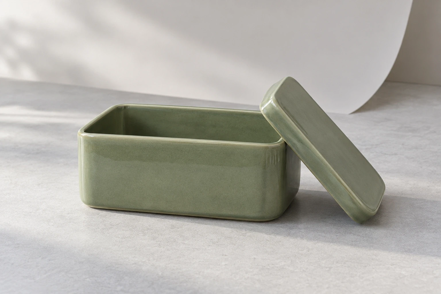
Conceptual illustration: separately generated fictional ceramic scene. It is not another view of the hero, the geometric fixture or a documented styling test.
Add props without creating a second subject
A prop can suggest use, introduce a direction or connect the product to a setting. It should not quietly become the most prominent shape in the frame. Adobe's product photography guidance similarly recommends a clear product focal point, breathing room and restrained styling.
For the tin, a paper curve behind it might echo the lid. But a line passing through the front patch would interrupt the surface we chose to emphasize. Move the curve outside that region or simplify it. If a separate lid is shown, make its relationship to the container clear rather than allowing it to resemble an unrelated second product.
Check overlaps through the camera. Two objects that have physical space between them can still merge into one outline in the photograph. A small lateral move may separate them; raising the camera may do so too, but could sacrifice the front view you already selected. Recheck both consequences before accepting the adjustment.
Use this table when a composition feels wrong but “make it cleaner” is too vague to direct a correction.
Change the variable responsible for the problem
Visible problem | Adjustment to try |
|---|---|
Front panel looks compressed | Lower the camera and recheck how much lid remains visible. |
Lid is barely distinguishable | Raise the camera gradually, checking what the front panel loses. |
Product competes with the copy area | Keep the chosen view; change placement or framing to reserve the agreed space. |
Prop merges with the product outline | Move the prop or adjust lateral separation, then inspect through the camera. |
Styling attracts attention before the chosen surface | Reduce the competing shape, brightness or overlap and compare at display size. |
Proposed adjustments for your own product; recheck the selected surface after each change.
Keep the product itself fixed while comparing the first camera alternatives. After choosing a view, adjust placement and props. This makes it easier to tell whether an improvement came from the viewpoint, the framing or the styling. It is a proposed working method, not a report of a physical test conducted for this article.
For a commissioned scene, the lifestyle product photography services guide helps turn the composition into a production brief. Include a reference for the chosen view and state the primary surface, the intended placement and any reserved copy area. A mood board alone leaves those decisions open.
If using Look Atlas for generated creative imagery, carry that same direction alongside accurate product references. Treat a generated scene as a candidate to review, not evidence that an unseen surface or label has been reconstructed correctly. The conceptual images here are fictional illustrations, separate from the controlled geometric example.
Approve the composition at the size it will be seen
Open the intended placement without enlarging it. Can you identify the selected surface? Does the secondary feature still contribute, or has it become an unexplained sliver? Does a prop claim more attention than the product? Review any actual label text separately for legibility; the geometric patch experiment cannot answer that question.
For our hypothetical tin, a useful brief could end: “Prioritize the front panel, show enough lid to describe the closure, and leave the agreed copy area clear.” If the top design becomes the subject of another image, change that priority explicitly. The composition is then a deliberate allocation of space, rather than a familiar arrangement applied to every product.
